The UN has warned that the goal of limiting global warming to “well below 2ºC above pre-industrial levels” is in danger because major economies, including the US and the EU, are falling short of their pledges.
But scientists at the Intergovernmental Panel on Climate Change (IPCC) – the leading international body on global warming – argue the 2ºC pledge in the 2015 Paris accord didn’t go far enough. The global average temperature rise actually needs to be kept below 1.5ºC, they say.
So how warm has the world got and what can we do about it? Here are some simple graphs that explain climate change in a nutshell.
5 Graphs that explain climate change and what we can do to help
1. The world has been getting hotter
The world is now nearly one degree warmer than it was before widespread industrialisation, according to the World Meteorological Organization (WMO).
The 20 warmest years on record have been in the past 22 years, with 2015-2018. If this trend continues, temperatures may rise by 3-5ºC by 2100.
One degree may not sound like much, but, according to the IPCC, if countries fail to act, the world will face catastrophic change – sea levels will rise, ocean temperatures and acidity will increase and our ability to grow crops, such as rice, maize and wheat, would be in danger.
Graphs that explain climate change:
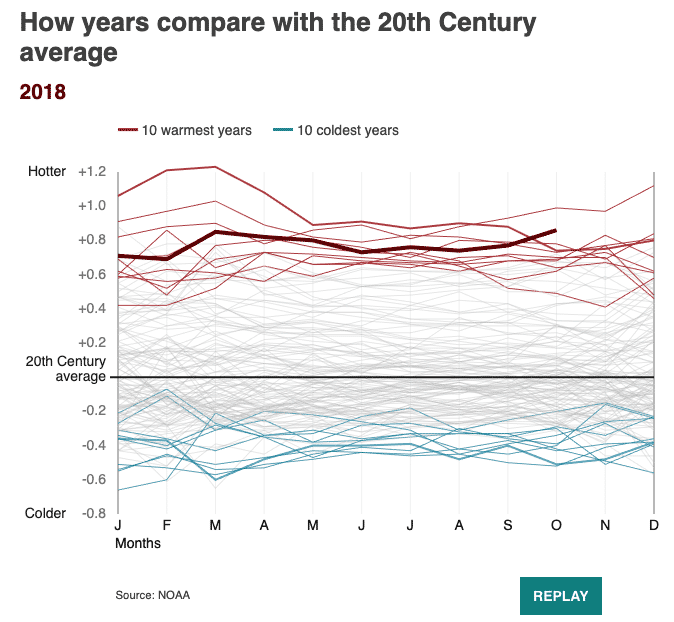
Image source: BBC
2. We are not on track to meet climate change targets
If we add up all the promises to cut emissions made by countries that have signed the Paris climate agreement, the world would still warm by more than 3ºC by the end of this century.
For decades, researchers argued the global temperature rise must be kept below 2ºC by the end of this century to avoid the worst impacts.
Countries signing up to the Paris agreement pledged to keep temperatures “well below 2ºC above pre-industrial levels and to pursue efforts to limit the temperature increase even further to 1.5ºC”.
But scientists now agree that we actually need to keep temperature rises to below 1.5C.
Graphs that explain climate change:
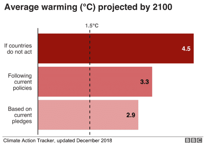
Image source: BBC
3. The biggest emitters are China and the US
The countries emitting the most greenhouse gases by quite a long way are China and the US. Together they account for more than 40% of the global total, according to 2017 data.
US environmental policy has shifted under the Trump administration, which has pursued a pro-fossil fuels agenda. After taking office, President Donald Trump announced the US would withdraw from the Paris climate change agreement.
At the time, Mr Trump said he wanted to negotiate a new “fair” deal that would not disadvantage US businesses and workers.
Graphs that explain climate change:
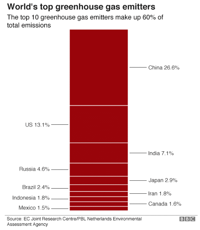
Image source: BBC
4. Arctic sea ice is also in danger
The extent of Arctic sea ice has dropped in recent years. It reached its lowest point on record in 2012.
Sea ice has been reducing for decades, with melting accelerating since the early 2000s. The Arctic Ocean may be ice free in the summer as soon as the 2050s, unless emissions are reduced, the committee has said.
Graphs that explain climate change:
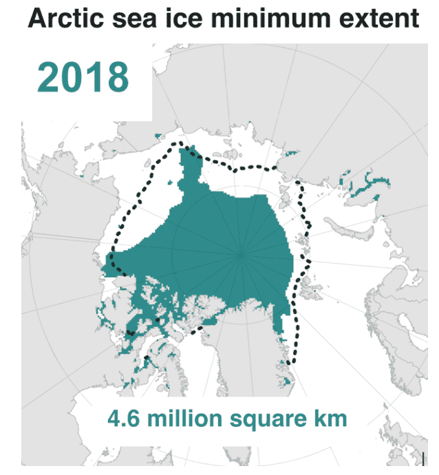
Image source: BBC
5. We can all do more to help
While governments need to make big changes – individuals can play a role too.
Scientists say we all have to make “rapid, far-reaching and unprecedented changes” to our lifestyles, in order to avoid severely damaging climate change.
The IPCC says we need to: buy less meat, milk, cheese and butter; eat more locally sourced seasonal food – and throw less of it away; drive electric cars but walk or cycle short distances; take trains and buses instead of planes; use videoconferencing instead of business travel; use a washing line instead of a tumble dryer; insulate homes; demand low carbon in every consumer product.
The single biggest way to reduce your environmental impact on the planet is to modify your diet to include less meat – according to recent studies. Scientists say we ought to eat less meat because of the carbon emissions the meat industry produces, as well as other negative environmental impacts. Check out our article on the Planetary Health Diet.
But as well as altering our diets, research suggests that farming practices need to change significantly to benefit the environment.
Graphs that explain climate change:
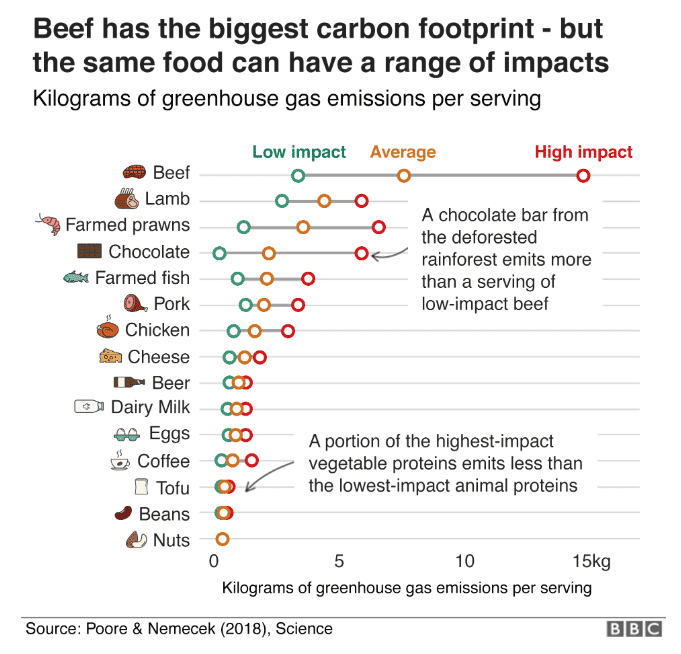
Image source: BBC
What do you think of this information? We´d love to hear from you in the Comments section below!
To keep up to date with all the latest Bios Urn® news and stories, you can follow us on Facebook, Instagram, Twitter, Pinterest and YouTube!
Source: BBC
Join our mailing list to keep you updated of all Bios® news and get a 10% Discount!


Leave a Reply